09 February, 2010
Mendocino shirt
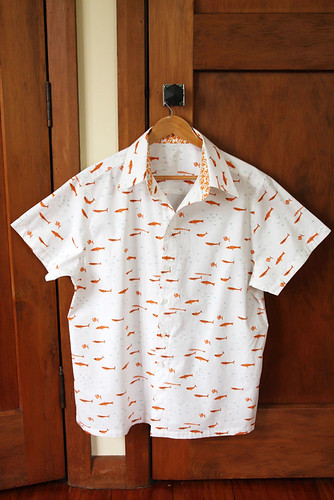
I'm not sure when I'll ever be organised enough to get a photo of Mat actually in this shirt, so I've taken advantage of it being clean and freshly ironed (hate actually ironing but the outcome is always so satisfying to the soul!) to take a photo.
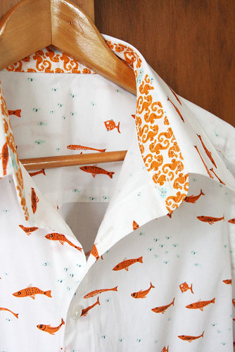
I'm really quite pleased with how it turned out, given the problems with the pattern. I'll never look at the shirt and think "what a masterpiece" but I got the sleeves sitting as well as I could and they're a million times better than they were, so that combined with the intense love I feel for the fabric means I smile a little smile when I see it and feel quietly pleased. One of Mat's professional specialities is archaeological fish bone, so we both love this fabric for different reasons! Aside from the lovely fish and their amusing expressions, I love the orange and blue together, I think it's my favourite colour combination at the moment. The actual prints are 'Seahorses' in Natural and 'Swimschool' in Pacific (or is it Glass Beach, I can't figure out these names!), you can see them all here and read about the collection at Heather's blog.
My favourite part of the shirt is undoubtedly the collar and collar stand - the seahorses go so well with the little fishies! The pop of the darker orange against the overall whiteness of the shirt really makes it.
Subscribe to:
Post Comments (Atom)


That shirt: is awesome. Fabulously, wonderfully, awesome! 9iwant to make one now too...)
ReplyDeletegreat shirt! love those two fabrics
ReplyDeletelove the shirt - I really don't think I would be confident enough to tackle one!
ReplyDeleteThis is just gorgeous and I can totally see Mat wearing it. I wish I could sew.
ReplyDeleteI really love this, what pattern did you use?
ReplyDeleteJacqui this shirt is stunning! It definitely looks like a masterpiece from where I'm sitting - you're just biased because you can always see every little tiny flaw in your own work, whereas nobody else can. So you should listen to us, hey!
ReplyDeleteIt's gorgeous and I do love the... what did you call it? The collar stand. Love that pop of dark orange! I just wish I was brave enough to tackle clothing like this.
I was gonna comment on that collar stand... it pops so nicely. I bet it's just adorable on him and gives just enough of a hint of orange. I've never ventured back to the collar stands after a terrible disaster I had with my one and only attempt. I need to get back on the horse though, that's such a lovely detail to add.
ReplyDeleteThanks for all the lovely compliments everyone :) I'm really quite happy with the shirt too - at least my job on it but I'm not happy with the pattern so much. For those who asked, it's McCall's 4079. The reviews on PatternReview are a bit mixed so clearly it's a shirt that fits some people well and not others. The fabric really saves it!
ReplyDeleteJacqui,
ReplyDeleteGreat job! I love blue and orange together also. They are the colors my husband chose for his comapny logo.
LOVE the shirt. That fabric is so cute!!! I so want to make Cam a shirt like that. I saw instructions on making the collar stand, man they were intimidating. Don't know if I'm up to that yet. Clothes are harder than quilting.
ReplyDeleteHello
ReplyDeleteWow it's really cool shirt..mainly i like that small fish designing part..is it for small kid?
Seahorse