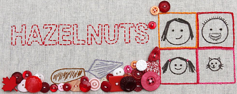
Well, another try at a new one anyway! I like this one much better, although it does bear a striking resemblance to the last one - but hey, let's just say I like to work within a theme and each year will be variations thereon. Yeah, that's it... I obviously like similar colours for the blog though, I thought that when I changed the photo that I'd need to do more matching of colours for post titles and links and so-on but apparently not. Nope, many of the colours appeared to be the same more-or-less, not that I discovered that until I'd pulled all the html codes for the various colours in the image and plugged them in and...not much changed! Ah, it's a sobering realisation when you think you're really moving away in a new direction only to discover that really you're just doing a small zig-zag in your rut :))
Actually, I wrote that and then had a fabulous idea for a different header which I'm currently exploring - stay tuned!

It is all good fun isn't it.
ReplyDeleteLove the colours you have for yours,
Definitely like this one better than the other's you experimented with. It's enough like the old one but different. I love the typeface.
ReplyDeletelove it!
ReplyDelete